|
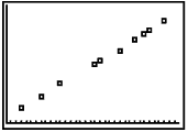
A scatter plot is a
graph used to determine whether
there is a relationship between
paired data.
|
In
many real-life situations, scatter plots follow patterns
that are approximately linear. If y tends to
increase as x increases, then the paired data are
said to be a positive correlation. If y tends to decrease as x increases, the paired data are
said to be a negative correlation. If the
points show no linear pattern, the paired data are said to
have relatively no correlation. |
 |
To set up a scatter plot:
Clear
(or deactivate) any entries in "Y=" before you begin.
1. Enter the
X data
values in L1. Enter the Y data values
in L2, being careful that each
X data value and
its matching Y data value are entered on the same horizontal line.
(See
Basic Commands for entering data.) |
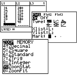 |
2. Activate the
scatter plot. Press 2nd STATPLOT
and choose #1 PLOT 1. You
will see the screen at the right. Be
sure the plot is ON, the scatter plot icon is highlighted, and
that the list of the X data values are next to
Xlist, and the list of the Y data values are
next to
Ylist. Choose any of the three marks. |
3. To see the
scatter plot, press ZOOM
and #9 ZoomStat. Hitting
TRACE and right arrow will move
along the data points.
4.
To turn the scatter plot off, when you are finished with
this problem:
Method 1: Go to the
Y= screen. Arrow up onto
the PLOT highlighted at the top
of the screen.
Press ENTER to turn it off.
Method 2: Go to
STAT PLOT (above
Y=). Choose your
PLOT location. Arrow to
OFF.
Press ENTER to turn it off.
Follow-up:
*
At this point, the graph may be observed for the existence
of a positive, negative or no
correlation between the data.
*
A line of best fit can be calculated manually.
1. Select two points that you feel would give a line that
fits the data.
2. Using your knowledge of equations of lines and slope,
write the equation of your line.
3. Enter this equation into Y1 and graph.
4. How well does the line fit the data?
5. Use your line to make predictions.
* Or a line of best fit can be calculated "using the
calculator".
See Line of Best Fit. |
|