Nspire Stat Logo Main Page MathBits.com Table of Contents MathBits.com Terms of Use TI-84+ Web Site

Line of Best Fit

A line of best fit  (or "trend" line) is a straight line that best represents the data on a scatter plot. 
This line may pass through some of the points, none of the points, or all of the points.

 You can examine "lines of best fit" with:
     1.  paper and pencil only
     2.  a combination of graphing calculator and
           paper and pencil
     3.  or solely with the graphing calculator


Sandwich
Total Fat (g)
Total Calories
Hamburger
9
260
Cheeseburger
13
320
Quarter Pounder
21
420
Quarter Pounder with Cheese
30
530
Big Mac
31
560
Arch Sandwich Special
31
550
Arch Special with Bacon
34
590
Crispy Chicken
25
500
Fish Fillet
28
560
Grilled Chicken
20
440
Grilled Chicken Light
5
300

Example:  
Is there a relationship between the fat grams and the total calories in fast food?
(refer to the data at the left)


BurgerBoyDog


Paper and Pencil Solution:
See the bottom of this page for how to also do "my choice" line of best fit on the calculator.

1.  Prepare a scatter plot of the data on graph paper.

2.  Using a strand of spaghetti, position the spaghetti so that the plotted points are as close to the strand as possible. Bibs, the cat, is assisting with the spaghetti alignment for this example.

Spaghetti Alignment
3.  Find two points that you think will be on the "best-fit" line.  Perhaps you chose the points
(9, 260) and (30, 530).  Different people may choose different points. 

4.  Calculate the slope of the line through your two points (rounded to three decimal places).
       
             line f5

5.  Write the equation of the line.  This equation can now be used to predict information that was not plotted in the scatter plot.  For example, you can use the equation to find the total calories based upon 22 grams of fat.          

Equation:
line f6
or  y = 12.857x + 144.287
 
Prediction based on 22 grams of fat:
line f7

Different people may choose different points and arrive at different equations.  All of these equations are "correct", but which one is actually the "best"?  To determine the actual "best" fit, we will use a graphing calculator.


Graphing Calculator Solution:
1.  Enter the data into Lists and Spreadsheets. Column A will be labeled "fat" (for the fat grams) and column B will be labeled "cal" (for the calories).
See Lists and Spreadsheets for how to enter data.
list entry

2.  Graph the scatter plot. Fromhome key , choose #5 Data and Statistics. Hit ENTER.
Using the Nav Pad, arrow to the bottom of the screen and choose the x-variable to be "fat". Then move to the left side of the screen and choose the y-variable to be "cal". You will now see your scatter plot.

plot
plot
3. NOW, have the calculator determine the BEST "line of best fit".
A "line of best fit" is referred to as a linear regression.
From menu key, choose #3 Actions, #5 Regression, and #1Show Linear (mx + b). The graph will appear with the "line of best fit" equation (the linear regression equation).
linear regression
linear regression 2

Linear Regression
Note: You can "grab" any of the points
and move them. The equation will
change accordingly, as will the
spreadsheet entries.

Important Note:

If your calculator is set to FLOAT, this linear regression equation will be rounded to the nearest integer.

If you calculator is set to FLOAT 6 (the default), this linear regression equation will contain 6 decimal places which may contain inaccurate trailing zeros.


Graphing calculator "line of best fit": y = 11.7313x + 193.852
(using default settings on calculator - minus the trailing zeros)

Paper and Pencil Solution on the Calculator:
If you prepare your scatter plot on the Graphs & Geometry page, you can examine "your own" line of best fit on the calculator including its equation. After you enter your data ....

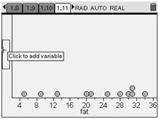
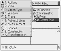
From HOME, choose #2 Graphs&Geometry. From MENU, choose #3 Graph Type and #4 Scatter Plot, as seen at the right. Hit ENTER.

G&G Scatter Plot
 
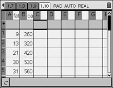
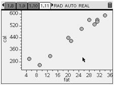
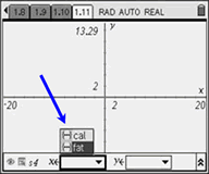
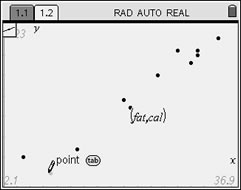
At the bottom of the screen, highlight the box naming the set to be used for the x-values, click, and choose "fat". Use your TAB key to highlight box if needed. Do the same for the y set and choose "cal".
x set
both sets
 
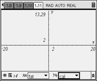
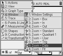
From MENU, choose #4 Window and #9 Zoom Data, to set the window for the plot.
Hit ENTER.
Zoom Data

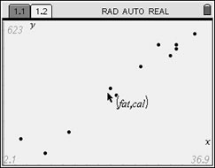
In the graph at the right, the Entry Line was hidden to allow for a full view of the graph.

To hide entry line:
CTRL- G
or MENU, View,
#6 Entry Line

arrow

line points
   
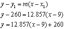
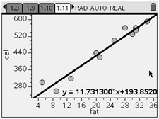
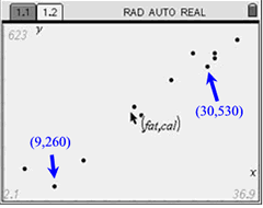
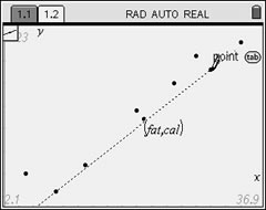
As we did with pencil and paper, choose two points that you think will be on the "best-fit" line.  Perhaps you choose again the points (9, 260) and (30, 530).  Different people may still choose different points. 
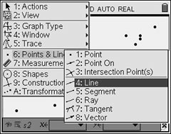
plot labeled 2

From this screen,
choose
MENU,
#6 Points & Lines,
#4 Line

arrow

line menus
 
pencil 1
Move the pencil to the first point
of your choice (9,260)
. Enter.

arrow

(Should you make a mistake, use CTRL - ESC
to undo the mistake.)

pencil 2
Move the pencil to the first point
of your choice (9,260)
. Enter.

Now, get the equation of the line:
action equation
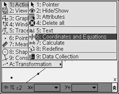
Highlight the line. Hit MENU. #1 Action,
#6 Coordinates and Equations

arrow
Read the equation.

equation
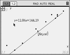
Drag the equation so it can
be clearly seen.


Table of Contents | MathBits.com | Terms of Use